You can choose several options to determine how users proceed through your Guide steps.
Step types
You can record two types of steps: Explanation or Interaction steps.
Explanation steps
The simplest Guides are a path of Explanation steps where users click Next in your Guide to proceed.

There are two kinds of explanation steps, where you can proceed with the “Next” button:
An explanation step where interaction is prevented (Interaction prevented)
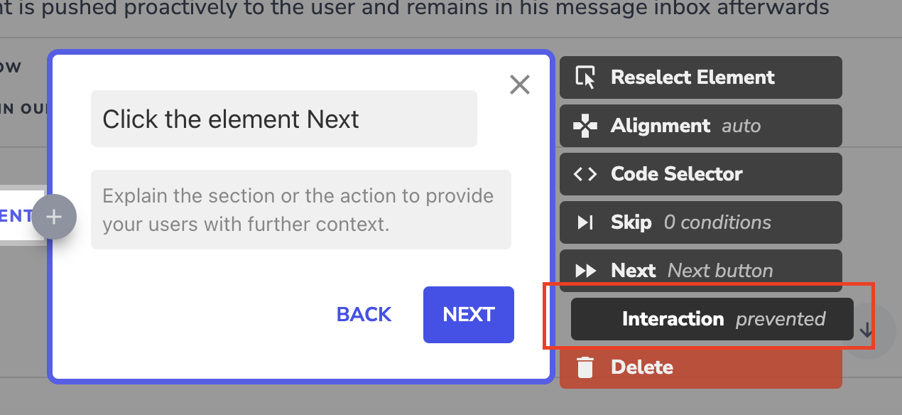

ℹ️ Explanation steps with interaction: prevented are considered optional and will be skipped if the element is not found.
An explanation step where the end user should interact with the highlighted area (Interaction allowed)
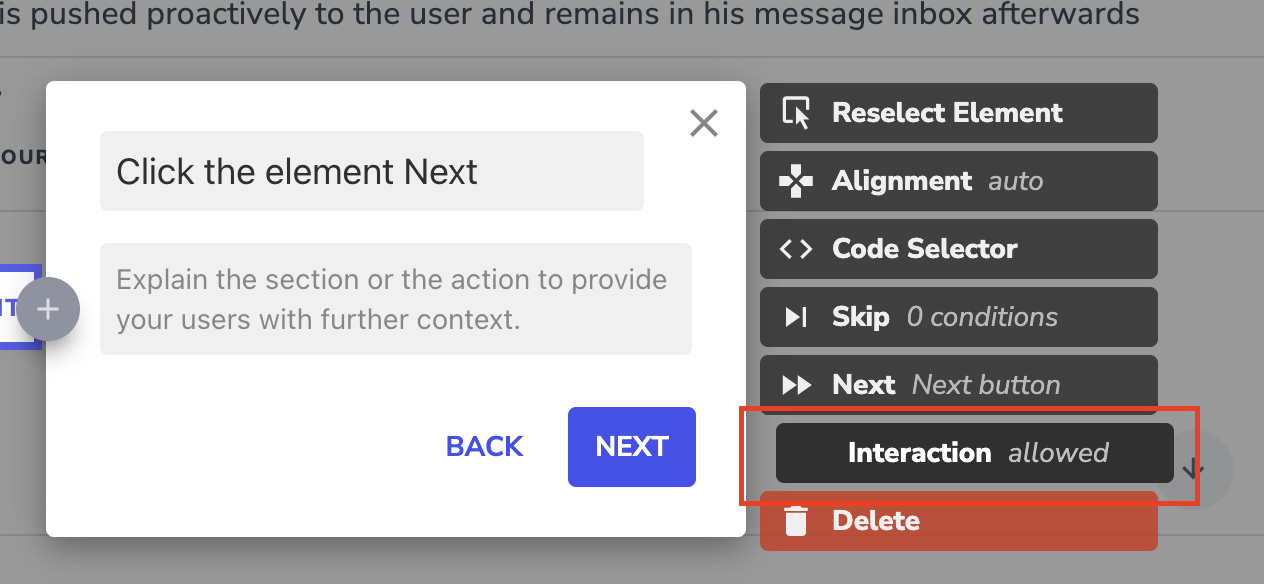

ℹ️ This step allows the User to interact with an element as many times as they want before moving to the next step. This could be used for elements that are self-explanatory and recording every element that does not make sense, e.g. date pickers.
Interaction steps
Interaction steps require user interaction with your app. These are particularly useful for deeper product tours, learning processes, or where input validation is required.

ℹ️ We recommend explanation steps for simple product walkthroughs and navigation tours and interaction steps for more complex navigation or process flows.
More step options:
Any value
When a user needs to fill out a field at any step of your Guide, and you want the user to enter any value into an input field, you can use the “Any value” option. This option can only be chosen if an input field or a system dropdown is recorded.

By clicking on Any Value you can specify what action needs to be taken to continue:

Specific value
If it is required for users to input a specific value or select a specific option in a system dropdown you should use the specific value option. The user can type in the needed value or use the autofill button. You can decide if the Guide should automatically proceed with "field remains active for input validation" (default setting), if it should automatically proceed with "field becomes inactive with input validation" or if the user needs to hit the enter key.

By clicking on Specific Value you can specify what action needs to be taken to continue:

You can also use this step type to validate user input. For more information on validation, check the following support article.
Hover
Use this option if the user needs to hover over an element in order to proceed to the next step. This step can not be recorded directly and needs to be adjusted in the Editor.

Double click
Use this if a double click is required for your application.

Drag & Drop
Use this when a user needs to drag and drop. This cannot be recorded directly. In a Userlane Guide, dragging and dropping are two individual steps. Thus, record the step where the drag should start in the Editor and choose “Drag” in the “Next” section. Then, record the step that the element should be dropped and choose “Drop” in the “Next” section.

Right click
The Guide will proceed when the user performs a right-click.

Left click mouse-down & right click mouse-down
Sometimes a left or right click element doesn’t work. This might be the case if certain elements are defined as mouse-down elements in the page code of your application and would not react to a regular click. In these cases, you just redefine a step as a “left click mouse-down” or “right click mouse-down”.
Some step types can be automated. To learn more about the automation options available in Userlane, check the following support article.
