About Tooltips
Tooltips allow you to explain and highlight elements of the underlying application.
Using Tooltips, Managers can provide process-related information to users to help them complete certain processes or show them new features by grabbing their attention with the help of a pulsating icon.
Who can create a Tooltip?
There is a single Tooltip edit mode to create, save, edit, and publish all in one view in the Editor.
Admins and Moderators can create, save, edit, and publish Tooltips in the Editor. Contributors can do almost everything, except that they cannot publish tooltips or edit or delete already live tooltips.
Record a Tooltip
To record a new Tooltip:
- Select Tooltip from the Create dropdown in the Editor. If you are already on the Tooltip tab, you can click Create.
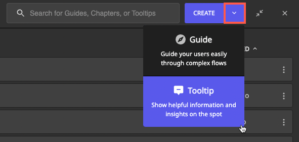 The Editor is minimized in the bottom left of your screen.
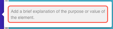
 - Select the target element for the Tooltip, e.g., a button, input field, or menu. A description input box displays.
- Type a helpful description of the element.
- Define the settings. You can add choose the Tooltip type, can reselect an element if needed, set a segment, link it to a Guide, and choose the publishing language.
 The Editor is minimized in the bottom left of your screen.
5. Save the Tooltip.
Tooltip Type
You can choose either Hint or Beacon as Tooltip type depending on your use case.

- Hints are used to display the content on hover. They can provide additional information to help users finalize a process or explain unknown words, features, or specific error messages.
- Beacons are animated icons that display the content on click and disappear after the interaction. They are used to draw the user's attention to a new feature or change in the underlying application, or they could be used as a call to action (e.g., to ask end users to report a bug in case an alert pops up).
ℹ️ The state of a beacon is stored in the web browser's local storage. If a user clicks on a beacon, that beacon will not be shown to him as long as the same web browser is used.
Set icon (only for Hint)
You can choose whether the hint becomes visible only after the user hovers over the selected element or whether there is a help icon (i) next to the element that the user can hover over to make the hint text visible. You can set this up in Editor under the Icon tab:
Set icon position
If you decide to use the help icon, you can position it in 2 modes:
automatic (default): the icon's position is automatically determined by Userlane.
manual: manually select the icon position from eight positions, including four internal ones (inside the element).
Set hint position (only for Hints without an icon)
For Hints without an icon you can also determine the position of the Hint itself. You can decide whether it should appear above, below, or to the right or left of the selected element for your Hint.

Icon color setting
You can set the color of the hint and beacon icons to match your corporate identity or the individual app palette.
The color setting of your icons can be adjusted in Customise > Design screen in the Portal.
Tooltip Segment
Page Segmentation and User Segmentation
- Show the Tooltip only to the relevant group of users, e.g., based on user behaviour.
- Choose where the Tooltip will be shown with the help of page segments.

Note: Segmentation applied to Tooltips will not be active in the editor. The segmentation will be active in the end user view.
Add a Guide
Managers can link a Guide (from any step) to a Tooltip to help users learn the processes based on context and finalize them more confidently. Guides can be connected to either Hints or Beacons.

When a Tooltip is shown on the page, Userlane determines whether to show the linked Guide based on the following two criteria:
- the status of the Guide (published or unpublished)
- the segmentation of the Guide
Translate a Tooltip
You can translate Tooltips within the Editor or outside Userlane.
Translating Tooltips within Userlane
You can translate Tooltips from the Editor automatically or manually.
One option to translate your content is to use the auto-translate functionality. To do that, open the more-menu section and click on Auto-Translate Tooltip.

Follow the instructions available in the Editor to translate your Tooltip's text from the source language to the selected target languages.
During the auto-translation process, you cannot edit the Tooltip's text. A notification will be displayed once the translation is finalized.
ℹ️ The "auto-translate" feature relies on OpenAI API, a service provided by Microsoft. No Personal Identifiable Information (PII) or Sensitive Personal Information (SPI) is being processed when used. No prompts or completions are stored in the model during these operations, and prompts and completions are not used to train, retrain or improve the models.
For additional questions, please don't hesitate to contact our Customer Success Team.
Translating Tooltips outside Userlane
Use the Export/Import Text feature to import your initial default texts or bulk export your texts in all active languages to a CSV or XLSX file. You can use this file to review, edit, and translate texts, then import it to apply all your changes at once.
To access it, go to Customize > Languages > Export/Import

When you click Export/Import, a modal describing the export and import processes will pop up.
Language Management
Sign into Portal > Customize > Languages
- you can see if there are any Tooltips related to a language.
Tooltips are part of the content that can be published or unpublished via one action under this tab.
Tooltip content is removed if the corresponding language is deleted.
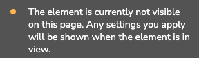
Element Status
A tooltip will show a notification with an orange dot in case the element is not visible on this page:
How to update and maintain Tooltips
In time, you will have dozens or hundreds of Tooltips published simultaneously. Userlane contains different features that help Managers easily find the Tooltip they wish to edit.
Tooltips naming
When you create a Tooltip, Userlane will grab all relevant information associated with the selected element and assign it to the Tooltip name.
Example: button 'Dashboard' Tooltip 16 Nov, 18:02
You can edit the Tooltip name anytime - we recommend doing that after you decide on a pattern you wish to follow with your team. For example, you could also add the page or process to the Tooltip name.
Tooltips search
Use the search functionality on the top of the Editor to find the Tooltip you wish to edit. Userlane filters the results by looking at the Tooltip name and text description.
Tooltips available on current page
To find the Tooltip you wish to edit, you don't have to go through the entire list of Tooltips available in the Editor. You can click on "Show on current page" and Userlane will filter for you the Tooltips that can be found on that page.

Tooltips that are hidden behind a modal or dropdown won't be made available using this feature. For that, we recommend the method below, which also provides more contextual information to the editors.
Edit Tooltips on the spot
To find the Tooltip you wish to edit or improve, you need to see what your end-users see.

When the Editor is minimized or in the Preview mode, navigate the underlying application, find the Tooltip you wish to edit, hover over the textbox, and then click the settings button. Userlane will redirect you to the Tooltip you want to edit, allowing you to edit the Tooltip text and settings on the spot.
Troubleshooting tooltip positioning and layering
If a tooltip is hidden behind other UI elements, appears in an unexpected position, or is clipped at the screen edge, this is almost always caused by how your application's CSS handles layering — not a bug in Userlane. The sections below cover the most common cases.
Z-index conflicts
Every element on a web page has a stacking order controlled by the CSS z-index property. When your application assigns a very high z-index to a panel, modal, or navigation bar, Userlane tooltips can end up behind it and become invisible or unclickable.
Userlane tooltips render with a z-index of 1,000,000 by default — intentionally high to appear above most application UI. However, some enterprise frameworks (such as SAP Fiori or Salesforce Lightning) use z-index values at or above this threshold.
ℹ️ Userlane's maximum supported z-index is 1,000,000. If your application uses z-index values at or above this number, tooltips may not render above those elements. |
To check the z-index of a conflicting element without developer tools experience:
Right-click the element that is covering your tooltip.
Select Inspect or Inspect Element from the context menu (available in Chrome, Firefox, Edge, and Safari).
In the panel that opens, look at the Styles or Computed tab.
Search for "z-index" in the styles list. A high number (e.g., 9999 or 100000) indicates the conflicting element.
Share this information with your developer team or Userlane support to resolve the conflict.
The appendToTarget fix
The most effective fix for z-index conflicts is the appendToTarget setting in the tooltip's selector configuration. This attaches the tooltip directly to the target element in the DOM rather than the standard Userlane overlay layer, so it inherits the same stacking context as the annotated element.
Open the selector settings for the affected tooltip and add the following to the JSON configuration:
{
  "appendToTarget": true
} |
⚠️ Note: The appendToTarget property requires access to the tooltip's advanced selector settings. If you are unsure where to find this, refer to the Adjust the selector article or contact Userlane support.
CSS anchoring and detached tooltips
A tooltip may appear to "detach" from its target — positioned somewhere unexpected, such as in a screen corner or far from the annotated element. This is most commonly caused by CSS properties that create a new stacking context or transform the coordinate system of a parent container, including:
transform: translate(...) or any CSS transform on a parent element
position: fixed on a parent container
overflow: hidden on a scrollable parent
will-change: transform applied for animation purposes
The recommended fix is to enable appendToTarget (described above). If that does not resolve it, a developer may need to remove or scope the transform or position: fixed on the parent container. Use the Inspect Element tool and look for transform or will-change properties on parent elements of your target to identify the cause.
Off-screen and clipped tooltips
If a tooltip is partially off-screen or clipped at the edge of a container, it is recommended to reposition it in the Editor: Open the tooltip in the Userlane Editor and manually set the position to the opposite side of the element (e.g., switch from "above" to "below") to move it away from the clipped edge.
ℹ️ Keep tooltip text concise to reduce the risk of off-screen behavior on smaller viewports. If longer explanations are needed, consider linking to a Guide instead. |
